This photos are from the same place but were taken in two different days. The first four photos show the importance of shapes and lines in the composition of an image. The remaining are examples where the lines were there but not effective on a good composition. To catch the eye composition and framing are very important. You don't need to be a professional photographer to do this. By understanding this you will make your photos/snapshots look more interesting. And this is an ongoing task but one that gives pleasure and challenges you.
- GOOD EXAMPLES -
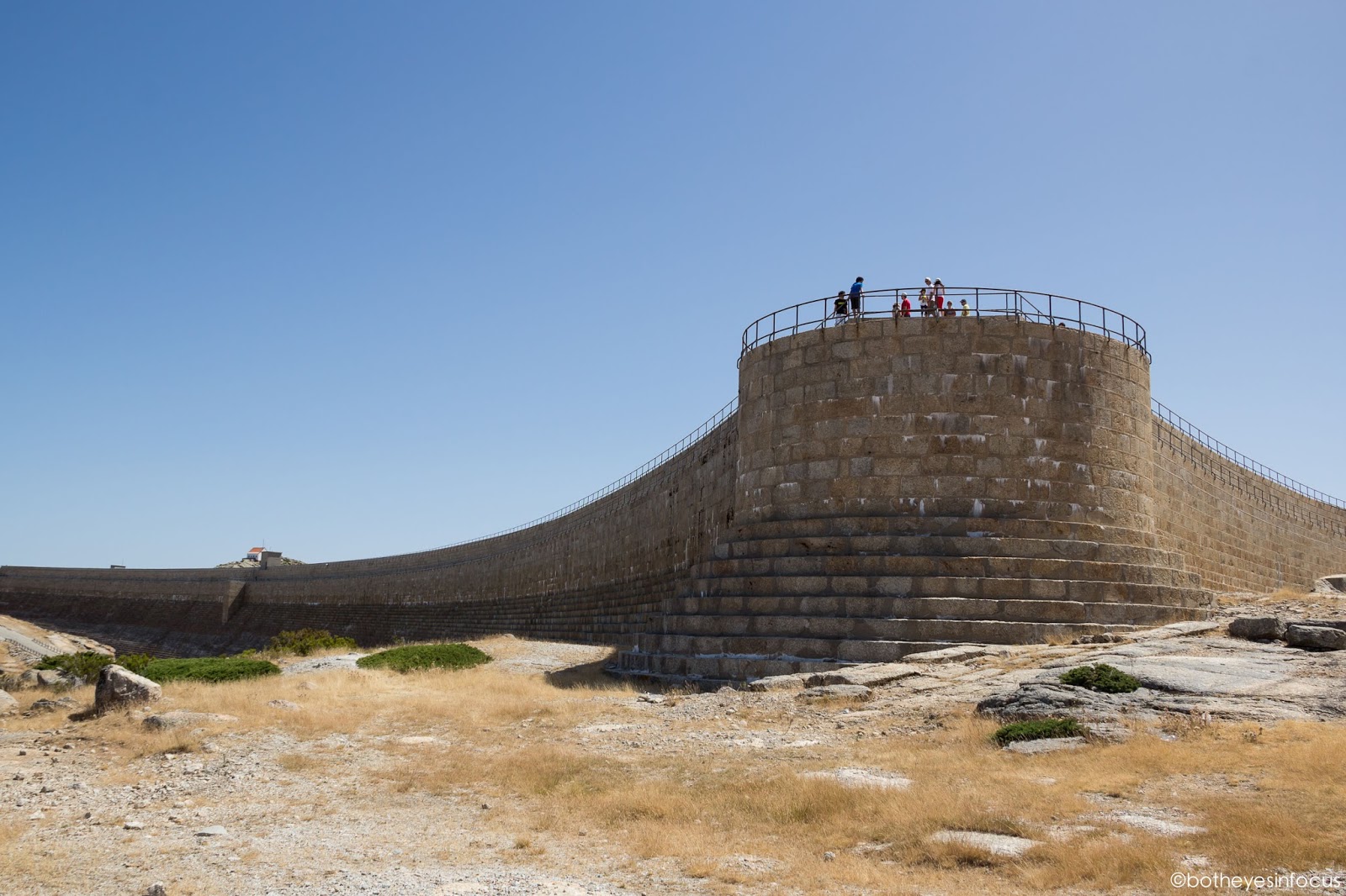 |
| A big and dominant shape, that divides the image in two parts, with the subjects (persons) positioned according the rule of thirds. |
 |
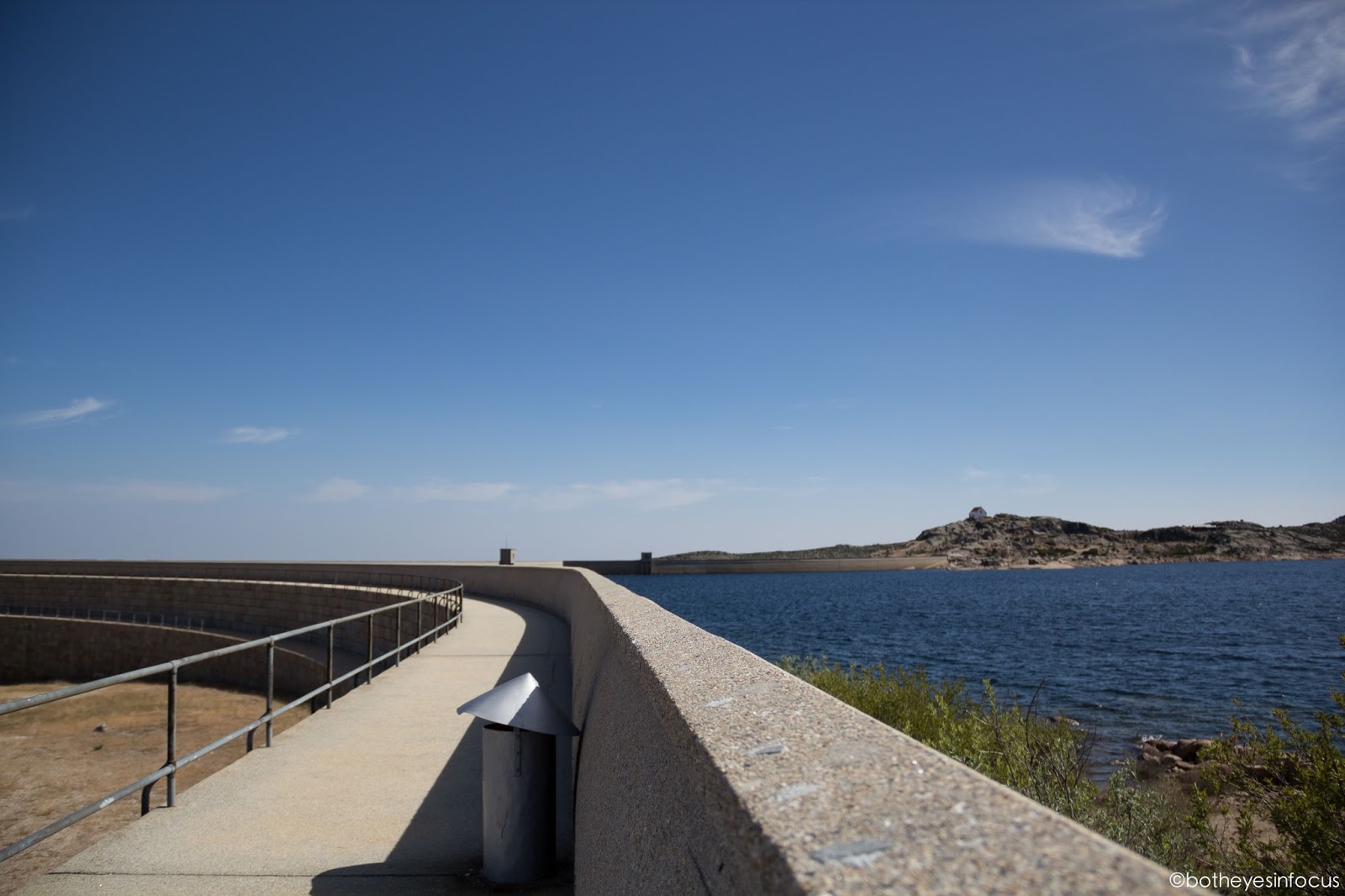
| The line on the left side leads the eye to a tiny house in the background. The house you see is not centred and this helps to break monotony. |
 |
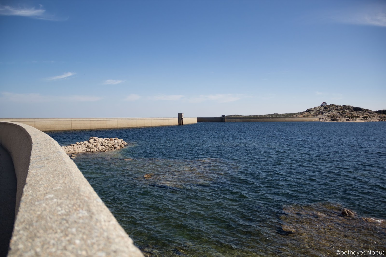
| A subject, rocks, in the foreground. In the background a line that divides the less intense blue of the sky with the blue of the water. |
 |
| This is an example showing that something is missing, it lacks a subject in the composition, a point of interest. Nevertheless you could see some lines and shapes in parallel, so the framing is ok but the composition is poor. |
- BAD EXAMPLES -
 |
| The lines don't lead the eye to any point of interest. Walk and see what works best. |
 |
| Bad framing, again the lines don't lead to any point of interest. |
 |
Other example of bad framing. The line on the left leads to nothing. The need to choose another angle and make a simple photo, at least.
I hope this was helpful in any way to some of you. To the ones that already know this you can always admire my best examples. I do not mind showing the less successful photos that I have taken because they make part of the process of learning. To analyse means you took the time to calm down and study an image making you more sensible to details and learning to observe better next time.
|


Comments
Post a Comment